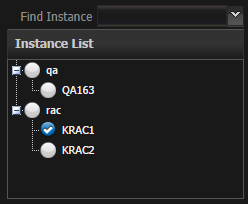
Overview
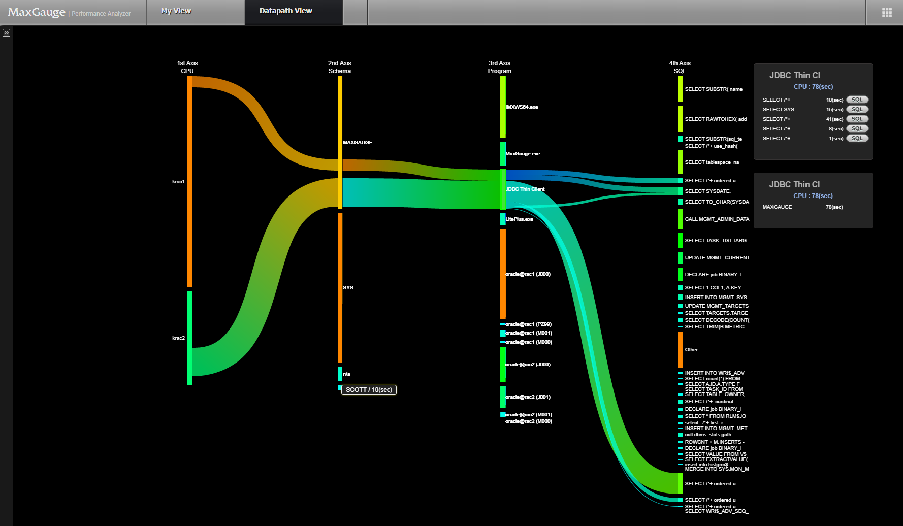
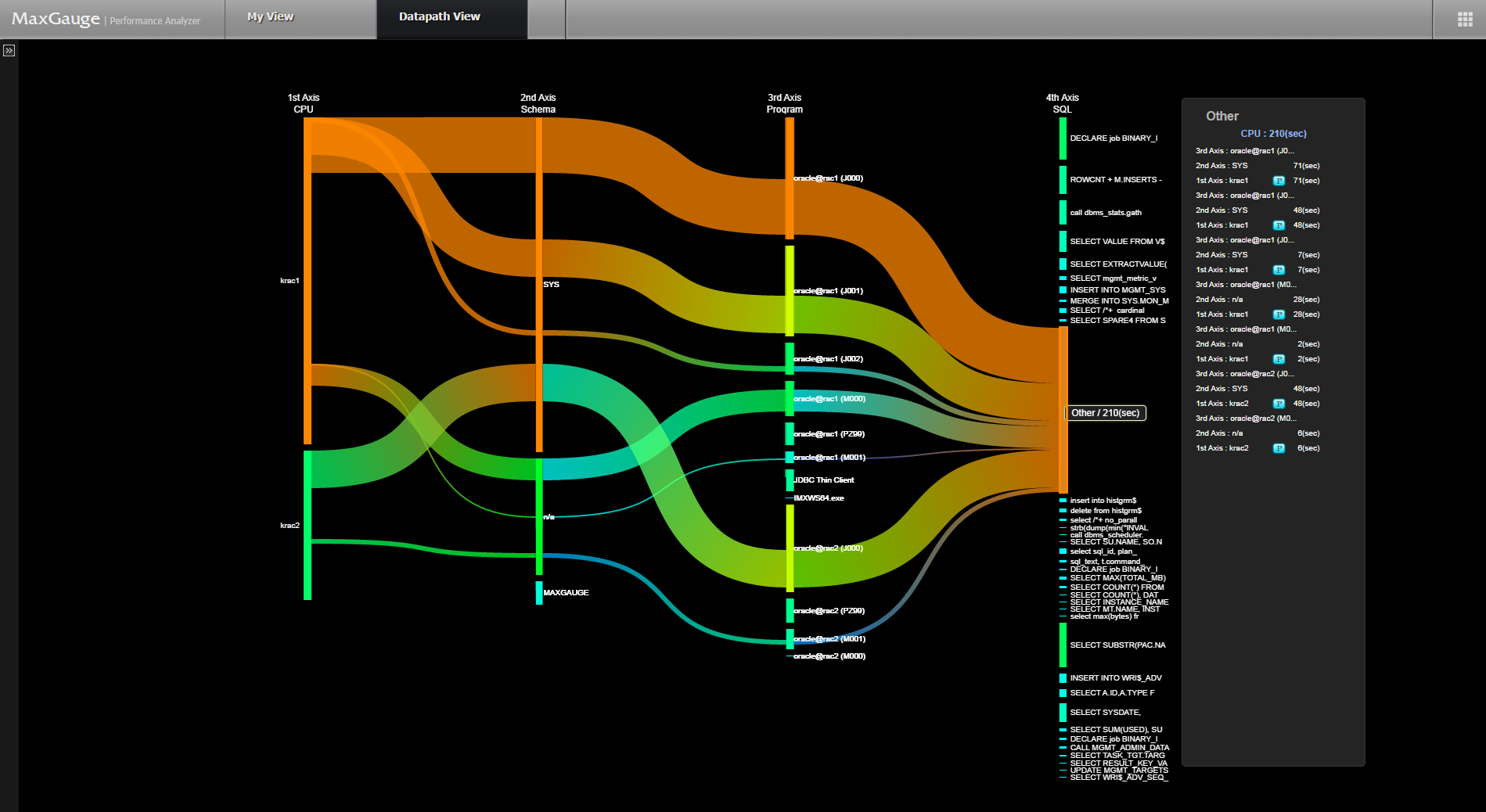
“A picture is the easiest word, and a word can be the most difficult picture.” This also applies to the database performance statistics analysis as well. Especially, in case of comparing multiple databases, long-term analysis on a particular database, and analysis on the correlation among Instance/ Schema/ Program/ SQL, if the Data Visualization technique does not apply, the corresponding tasks can be very stressful and time-consuming. Therefore, MaxGauge offers 3 types Data Visualization techniques in order to provide convenience to the users in regards to the task of analysis.
The Data Visualization techniques which have been applied to MaxGauge PA are as follows.
Table 3-1. Data Visualization Techniques Applied Screen Summary
| Data Visualization Techniques | View Name | Advantages |
|---|---|---|
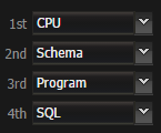
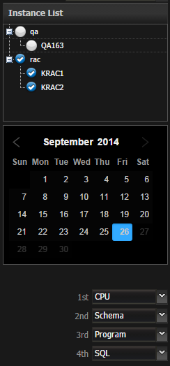
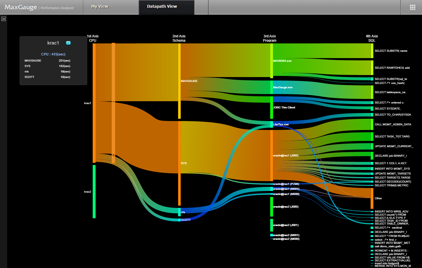
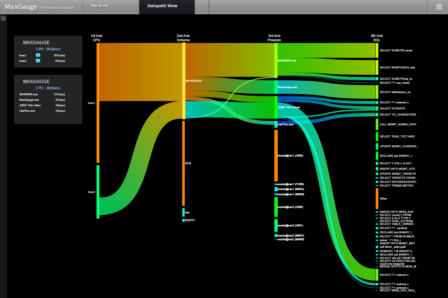
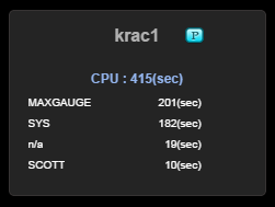
| Flow Visualization | Datapath View | Analyzes the correlation among Instance / Schema / Program / SQL into a flow |
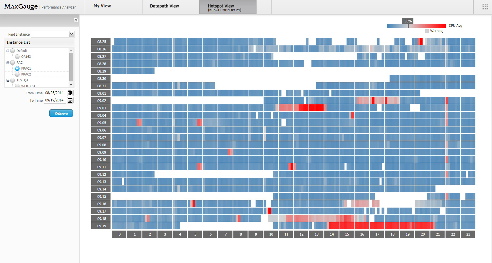
| Heap Map | Hotspot View | Convenience for Identifying the Hot Spot for Multiple Databases |
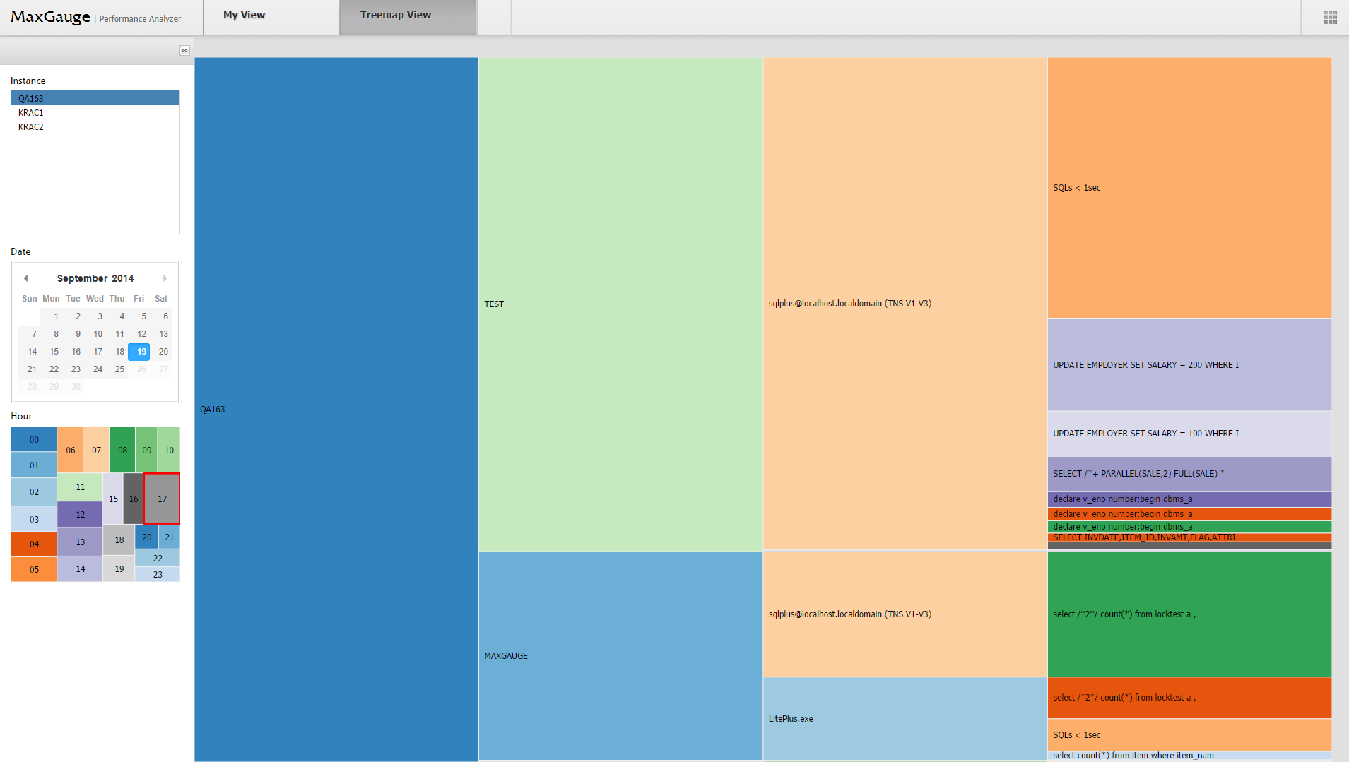
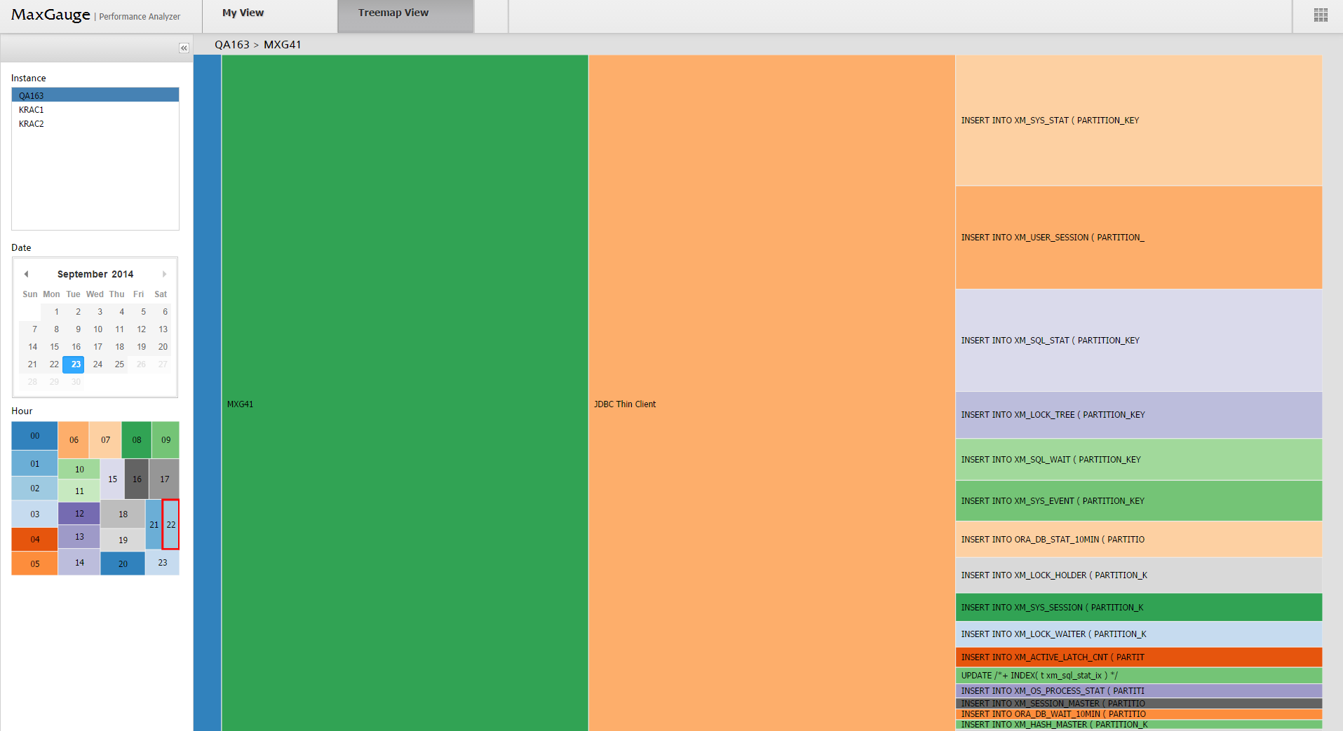
| Tree Mapping | Treemap View | Convenience for analyzing the hierarchy and the amount of Instance / Schema / Program / SQL |